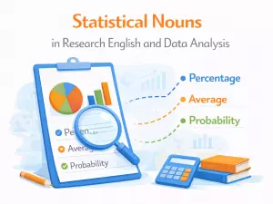
Nouns in Data Interpretation and Statistical Reporting

 This article explains key noun types for data interpretation, covering vocabulary for trends, comparisons, and cause-and-effect. It also addresses formality, common learner errors, and offers practice in accurately describing visual data.
- Core noun types used in data interpretation
- Trend and movement nouns in charts and graphs
- Comparison and proportion nouns in reporting
- Cause-and-effect nouns in data explanation
- Formality and precision in data-related nouns
- Common learner errors in data description
- Practice: describe visual data using correct nouns
Understanding how names for people, places, and things function in analyzing and presenting statistics is crucial for clear communication, as the terminology chosen can significantly influence how data is interpreted and understood. Using precise and consistent names helps avoid confusion, ensures the accuracy of the information being shared, and allows audiences to grasp the context and relevance of the statistics more effectively. Clarity in naming not only improves the credibility of the analysis but also enhances the overall impact and usefulness of the information presented.
Core noun types used in data interpretation
Analyzing data and reporting statistical findings relies heavily on precise and consistent use of noun forms. Different categories of nouns help clarify what is being measured, compared, or summarized in datasets and reports. Understanding these noun types ensures clarity, reduces ambiguity, and helps readers quickly grasp the underlying variables or entities involved.
Common noun categories in statistical contexts
Certain noun types frequently appear in the language of data analysis. These include both broad groupings and more specific terms, each serving a unique communicative function. For example, some nouns identify what is being measured, while others describe groups or time intervals. Here are several major categories often encountered:
- Variables: age, income, temperature, weight, score
- Categories: region, gender, department, type, segment
- Measures: mean, median, percentage, count, rate
- Groups: population, cohort, sample, subset, class
- Time periods: year, quarter, month, phase, interval
- Events: incident, occurrence, failure, response, case
- Items/Entities: product, respondent, observation, record, entry
- Units: dollar, kilogram, hour, unit, point
- Locations: site, area, city, facility, country
- Outcomes: result, score, status, trend, finding
- Attributes: value, characteristic, trait, feature, property
- Indicators: index, metric, parameter, benchmark, marker
Concrete vs. Abstract nouns in reports
Reports often alternate between concrete nouns (like “respondent” or “device”) and abstract nouns (such as “satisfaction” or “efficiency”). Concrete terms refer to countable or physical entities, while abstract ones highlight qualities, concepts, or aggregated measures.
Comparing noun types in data communication
To illustrate how these noun categories function in statistical narratives, consider the following structured comparison:
| Noun Type | Typical Examples | Role in Data Interpretation |
|---|---|---|
| Variable | income, age, score | Defines what is measured or observed |
| Measure | mean, percentage, count | Quantifies or summarizes data |
| Group | sample, cohort, class | Specifies the population or subset analyzed |
| Event | incident, failure, occurrence | Marks a specific happening or data point |
| Attribute | feature, property, characteristic | Describes qualities or aspects of entities |
Selecting the right noun form is not merely a stylistic choice; it shapes how data is interpreted, compared, and communicated. For analysts and writers, being attentive to these noun categories can help ensure that reports are accurate, accessible, and actionable.
Trend and movement nouns in charts and graphs
When interpreting visual data, such as line graphs, bar charts, or area graphs, it’s essential to choose precise nouns that describe changes over time or between categories. These nouns help clarify whether the data is increasing, decreasing, remaining stable, or showing volatility. Understanding these terms enables clearer communication of quantitative findings and trends.
Common nouns for trends and changes

Writers and analysts often rely on specific nouns to summarize movements in data. These words capture the direction, rate, or nature of the change:
- increase → There was a steady increase in energy consumption over the decade.
- rise → The rise in housing prices has made it difficult for young people to buy homes.
- growth → Rapid growth in the tech sector has created new employment opportunities.
- surge → The sudden surge in online sales surprised many retailers.
- jump → A sharp jump in inflation affected household budgets.
- climb → The gradual climb in temperatures indicates a long-term warming trend.
- decrease → A slight decrease in pollution levels was recorded last year.
- decline → The decline in birth rates is a concern for policymakers.
- drop → The report shows a significant drop in student absenteeism.
- fall → There was a dramatic fall in tourism during the pandemic.
- reduction → The reduction in carbon emissions resulted from stricter regulations.
- plunge → Stock markets experienced a sudden plunge after the announcement.
- collapse → The collapse of the local industry led to widespread unemployment.
- stability → Relative stability in prices has supported consumer confidence.
- fluctuation → Constant fluctuation in fuel costs complicates long-term planning.
- variation → The data show considerable variation between different age groups.
- volatility → High market volatility discourages long-term investment.
- peak → The number of daily cases reached its peak in January.
- trough → Economic activity hit a trough before beginning to recover.
- plateau → After several months of rapid growth, sales reached a plateau.
Nouns for describing the shape and pace of changes
Different nouns can highlight not just the direction but also the manner of movement. For example, a "spike" suggests a rapid upward movement, while a "dip" indicates a brief downward turn. These distinctions are useful for nuanced analysis.
- spike → A sudden spike in electricity demand caused temporary blackouts.
- dip → There was a brief dip in sales during the holiday weekend.
- upswing → The economy is showing an upswing after several years of stagnation.
- downturn → The global downturn led many companies to reduce their workforce.
- rebound → Tourism experienced a strong rebound once restrictions were lifted.
- slowdown → The recent slowdown in growth has worried investors.
- acceleration → The acceleration in productivity was linked to new technology.
- deceleration → A clear deceleration in price increases suggests lower inflation.
Structured comparison of trend nouns
| Noun | Typical Use/Implication |
|---|---|
| surge | A rapid and significant upward movement |
| decline | A general downward trend, sometimes gradual |
| fluctuation | Frequent, irregular changes in data values |
| plateau | A period of stability following a change |
| peak | The highest point reached before a reversal |
| trough | The lowest point before recovery or increase |
Choosing the right noun for a trend or movement provides precision and helps the audience quickly grasp the nature of the data. Whether describing a dramatic surge, a modest rise, or persistent volatility, accurate terminology supports effective statistical reporting and interpretation.
Comparison and proportion nouns in reporting
When interpreting data, writers and researchers often rely on nouns that express relationships between quantities, groups, or values. These nouns help clarify how different elements of a dataset relate to each other, whether by direct comparison or through proportional analysis. Using precise terminology makes statistical findings more accessible and meaningful to the audience.
Common nouns for expressing comparison
To show differences or similarities, certain nouns are frequently used. These facilitate clear communication about contrasts or parallels in the data. Here are some widely-used examples:
- difference → The difference between the two groups was statistically significant.
- gap → The income gap between rural and urban areas continues to widen.
- contrast → There is a clear contrast between the results of the first and second trials.
- advantage → This method offers a major advantage over traditional techniques.
- disparity → The disparity in access to healthcare raises ethical concerns.
- variation → There was considerable variation in students’ test scores.
- margin → The candidate won by a narrow margin of just 2%.
- lead → The company maintained a strong lead over its competitors.
- lag → There is a noticeable lag between policy decisions and their effects.
- ratio → The ratio of teachers to students has improved in recent years.
- equivalence → Statistical tests showed practical equivalence between the two treatments.
- similarity → The similarity in their responses suggests a shared experience.
Nouns for proportions and fractions
Describing parts of a whole or relationships between subsets and totals is essential in statistical reporting. Proportion nouns signal how much of a group or quantity is involved, often helping readers interpret scales and significance. Some key terms include:
- proportion → A large proportion of participants reported higher satisfaction.
- percentage → The percentage of correct answers increased after the training.
- fraction → Only a small fraction of the population was affected.
- majority → The majority of respondents supported the new policy.
- minority → A small minority expressed concerns about data privacy.
- share → Their market share grew steadily over the past decade.
- segment → The youth segment showed the strongest preference for online services.
- portion → A significant portion of the budget is allocated to education.
- quota → The quota for international students was increased this year.
- half → Nearly half of the survey participants were under 30.
- third → Almost a third of employees work remotely at least once a week.
- quarter → Approximately a quarter of the funds were spent on equipment.
- double → The number of users is now double what it was last year.
- triple → Energy consumption is almost triple the level recorded in 1990.
Structured examples: comparison vs. proportion nouns
It's helpful to see how these nouns are used in context. The following table distinguishes between typical comparison and proportion nouns, with brief explanations for each:
| Type | Example Nouns & Description |
|---|---|
| Comparison | difference, gap, contrast, margin Used to highlight distinctions or similarities between groups or values. |
| Proportion | percentage, majority, fraction, share Refer to parts of a whole or the size of a group within a total. |
| Ratio | ratio, double, triple, half Express quantitative relationships between two numbers or groups. |
| Distribution | segment, portion, quota, minority Describe the allocation or breakdown within a dataset. |
Tips for accurate reporting
Selecting the right noun depends on the relationship you wish to convey. For differences, opt for terms like gap or disparity. To emphasize how much of a group is involved, choose proportion or majority. Remember that clarity and precision in word choice help readers understand not just the numbers, but the story behind them.
Cause-and-effect nouns in data explanation
In statistical reporting, it's common to describe relationships where one variable influences another. Using precise nouns helps clarify these dynamics, making interpretations more transparent and actionable. Rather than relying solely on verbs, nouns that encapsulate causes, effects, or the linkage between variables can simplify complex findings, especially when summarizing results for varied audiences.
Common types of cause-and-effect nouns
Writers and analysts often use specific nouns to convey causality, impact, or outcome in data narratives. Some terms highlight direct drivers, while others indicate results or consequences. Choosing the right noun can reduce ambiguity and signal the nature of relationships being discussed.
- Influence – general impact one factor has on another
- Determinant – a key element that defines an outcome
- Effect – the result produced by a particular factor
- Cause – the origin of a certain change or result
- Consequence – a follow-up result, often unintended
- Outcome – the end result of a process or action
- Factor – any element contributing to a situation
- Result – the product of an action or event
- Reason – the explanation for a particular event
- Impact – the measurable effect on a variable
- Trigger – the specific element initiating a process
- Driver – an underlying force propelling change
- Mediator – a variable that transmits the effect of another
- Precursor – something that comes before and enables an effect
- Correlation – a relationship, not necessarily causal, between variables
- Association – a connection or link between elements
- Contribution – the part played by a variable in producing an effect
- Link – a general term for any connection between data points
Comparing direct and indirect causal nouns
Some nouns are best used for clear, direct relationships, while others describe more nuanced or indirect connections. The table below distinguishes between terms for straightforward causality and those for complex, mediated effects.
| Direct Relationship Nouns | Indirect/Complex Relationship Nouns |
|---|---|
| Cause | Mediator |
| Trigger | Precursor |
| Determinant | Association |
| Driver | Correlation |
| Effect | Contribution |
Usage tips for analytical writing
When selecting these nouns, consider the strength and nature of the relationship in your data. Avoid overstating causality if only correlation or association is present. Using the most accurate noun not only conveys your findings more effectively but also builds trust with your audience. Additionally, varying your word choice prevents repetition and keeps your reporting clear and engaging.
Formality and precision in data-related nouns
Choosing the right nouns is crucial when presenting or interpreting statistical results. The accuracy and clarity of your language can influence how data is perceived and understood. Formal writing in statistics and data science often relies on precise terminology to avoid ambiguity and support reproducibility.
Why precise nouns matter in statistical reporting
Ambiguous or informal noun usage can lead to misinterpretation of findings. For instance, using “numbers” instead of “values” may obscure whether you refer to raw data, counts, or calculated results. Similarly, “groups” and “categories” are not always interchangeable—each carries specific meaning in data analysis.
Common formal nouns in quantitative contexts
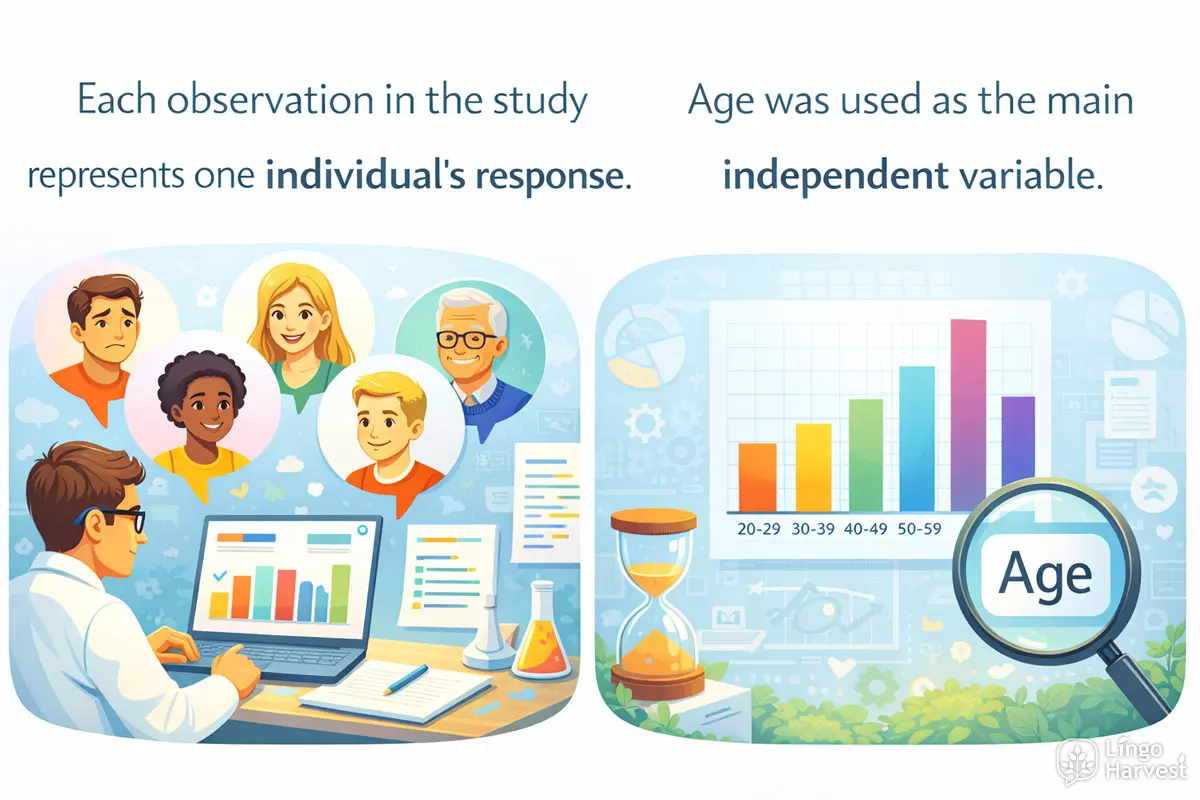
- Observation → Each observation in the study represents one individual’s response.
- Variable → Age was used as the main independent variable.
- Dataset → The dataset contains information from over 10,000 participants.
- Parameter → The parameter of interest is the true average income in the country.
- Statistic → The sample mean is a common statistic used to summarise data.
- Sample → The sample was randomly selected from the larger population.
- Population → The population includes all adults living in the city.
- Estimate → The estimate suggests that unemployment will decrease next year.
- Interval → The confidence interval shows the likely range of the true value.
- Distribution → The distribution of scores is roughly normal.
- Frequency → The table reports the frequency of each response category.
- Proportion → A high proportion of students achieved passing grades.
- Mean → The mean score increased after the new teaching method was introduced.
- Median → The median income is lower than the mean due to a few very high values.
- Mode → The mode of the dataset is the value that occurs most frequently.
- Outlier → One extreme value was treated as an outlier and removed from the analysis.
- Residual → A large residual indicates that the model does not fit that data point well.
- Covariate → Age was included as a covariate to control for its influence.
- Coefficient → The regression coefficient shows the strength and direction of the relationship.
Comparing informal and formal noun choices
Certain everyday words may seem sufficient but lack the specificity required in technical writing. The table below highlights some common informal nouns and their more precise formal counterparts, supporting clearer communication in analytical contexts.
| Informal Noun | Formal Equivalent |
|---|---|
| Thing | Observation / Variable |
| Group | Cohort / Category / Subset |
| Number | Value / Count / Statistic |
| Result | Estimate / Outcome / Parameter |
| Spread | Variance / Standard deviation |
| Amount | Frequency / Proportion / Total |
Guidelines for selecting nouns in data interpretation
- Prefer terms with established definitions in statistics.
- Avoid vague or colloquial language when describing data or findings.
- Clarify whether you refer to raw data, processed results, or theoretical constructs.
- When possible, match noun choice to the level of analysis (e.g., sample vs. population).
- Use plural or singular forms appropriately to distinguish between individual values and aggregated measures.
In summary, careful selection of nouns enhances the credibility and transparency of statistical communication. By favoring formal, precise language, analysts help their audience interpret results with confidence and accuracy.
Common learner errors in data description
Accurately describing data using nouns can be challenging for learners, especially when reporting statistics or interpreting results. Many students struggle with choosing the correct noun forms, quantifiers, or structures, which can lead to ambiguity or misinterpretation. Below are some of the most frequent pitfalls encountered when using nouns in statistical contexts.
Frequent noun-related mistakes
- Confusing countable and uncountable nouns (e.g., "datas" instead of "data").
- Incorrect pluralization of irregular nouns ("criterias" instead of "criteria").
- Mixing up singular and plural agreement ("The data is" vs. "The data are").
- Omitting necessary quantifiers ("A significant number of respondents" vs. "Significant respondents").
- Using vague nouns ("things increased" instead of specifying "sales increased").
- Redundant noun phrases ("the number of the amount of people").
- Inaccurate use of collective nouns ("a group of students was" vs. "a group of students were").
- Overusing general nouns ("stuff," "things") instead of precise statistical terms.
- Misplacing modifiers ("average monthly income" vs. "monthly average income").
- Switching noun forms mid-report ("percentage" vs. "percent").
- Failing to specify variables ("The increase was significant" – increase of what?).
- Using nouns instead of adjectives ("the data is significance" instead of "significant").
- Combining incompatible nouns ("the sum of average incomes").
- Incorrect preposition use with nouns ("the difference on" instead of "the difference between").
Examples of ambiguous versus clear noun usage
When learners describe results, subtle shifts in noun choice or structure can obscure meaning. Consider the following comparison:
| Ambiguous Example | Clearer Alternative |
|---|---|
| The amount of students increased. | The number of students increased. |
| The data shows a growth. | The data show an increase in sales. |
| There was a difference on results. | There was a difference between the results. |
| Several informations were missing. | Several pieces of information were missing. |
| The mean of the heights is higher. | The mean height is higher. |
Key tips to avoid confusion
Learners can improve their descriptive accuracy by:
- Reviewing whether nouns are countable or uncountable in academic English.
- Checking agreement between nouns and verbs, especially with collective terms.
- Using specific nouns related to data (e.g., "proportion," "median," "rate") rather than general words.
- Clarifying what each noun refers to within the context of the report.
- Practicing with real data sets and peer feedback to spot unclear noun usage.
By focusing on precision and consistency in noun choice, students can make their statistical reporting clearer and more reliable.
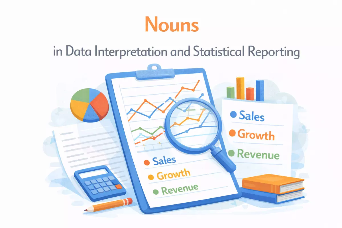
Practice: describe visual data using correct nouns
Interpreting graphs, charts, and tables accurately relies on choosing the most precise nouns for each type of data element. When reporting findings, it is important to distinguish between categories, measures, units, and trends using the appropriate terms. Below, you’ll find tasks and examples to help you practice selecting the best nouns for visual data description.
Common Nouns for Visual Data Description
- Bar → Each bar represents the average score for one class.
- Axis → The vertical axis shows the number of participants in each group.
- Segment → The darker segment of the bar indicates the proportion of female respondents.
- Value → The highest value on the chart appears in 2024.
- Proportion → The chart illustrates the proportion of students choosing each subject.
- Category → Each category on the horizontal axis corresponds to a different age group.
- Label → The label under the bar helps readers identify the country.
- Peak → The line reaches its peak in the third quarter.
- Trough → The trough marks the lowest level of sales during the year.
- Cluster → The cluster of bars compares three schools in the same district.
- Series → The blue series represents data from the experimental group.
- Variable → Income is the main variable plotted on the horizontal axis.
- Observation → Each point on the scatter plot is a single observation.
- Frequency → The histogram shows the frequency of each score interval.
- Percentage → The pie chart displays the percentage of responses in each category.
- Interval → The horizontal axis is divided into equal time intervals.
- Median → The median is marked with a line inside the boxplot.
- Range → The range is visible as the distance between the lowest and highest values.
- Outlier → The isolated point above the whisker indicates a possible outlier.
- Group → Each group is shown with a different colour for easy comparison.
Task: Identify the Correct Noun
- In a line graph showing monthly sales, what is the best noun for the highest point?
- When describing a pie chart, which noun refers to each colored division?
- On a scatter plot, what is each plotted dot called?
- In a table, what do you call each horizontal arrangement of data?
- In a bar chart, what is each rectangular shape representing a value called?
- On a chart, what do you call the text directly under a bar or next to a point?
- On a graph, what is the vertical or horizontal line used to measure values called?
- In a histogram, which noun refers to how often a value or interval occurs?
- In a boxplot, what noun refers to the distance between the smallest and largest values?
- On a scatter plot, what do you call a group of points that appear close together?
Show answers
- Peak
- Segment
- Observation (or Data Point)
- Row
- Bar
- Label
- Axis
- Frequency
- Range
- Cluster
Comparison Table: Visual Elements and Appropriate Nouns
| Visual Element | Recommended Noun(s) |
|---|---|
| Bar chart | Bar, category, value, axis |
| Pie chart | Segment, proportion, percentage |
| Line graph | Point, peak, trough, trend, series |
| Scatter plot | Observation, variable, cluster, outlier |
| Table | Row, column, cell, entry, group |
Short Practice: Describe the Data
Below are brief descriptions of visuals. Replace the underlined phrase with a more specific noun:
- The highest level of the line shows total revenue in June.
- Each section of the pie chart represents a department’s share.
- The dots on the scatter plot indicate individual survey responses.
- Every horizontal list in the table gives details for one respondent.
- Each rectangle in the bar chart shows the average score for a class.
- The values are measured along the vertical line with numbers on the left.
- The text under each bar names the corresponding country.
- The height of each bar in the histogram shows how often a value occurs.
- The whiskers in the boxplot show the distance between the lowest and highest values.
- On the scatter plot, there is a group of points close together in the upper-right corner.
Show answers
- Peak
- Segment
- Observation (or Data Point)
- Row
- Bar
- Axis
- Label
- Frequency
- Range
- Cluster
Consistent use of accurate nouns—such as “peak,” “segment,” or “observation”—makes your data interpretation more precise and easier to understand. Practice identifying and applying these terms when describing any type of visual information.